Hi there, it’s great to connect with a fellow wedding lover!

If we met earlier today, it was a genuine pleasure. If you’ve just found my card in your bag, welcome! I built Magic Moments for wedding pros who want a website that feels like a conversation, not a brochure.
As promised, here are 3 ways to make your wedding website work as hard as you do.
1. The "Human-First" Connection
Swap your "About" page for a "Connection" page.
Being honest - most 'About Me' pages are a bit of a snooze. They’re usually just a list of equipment or awards. But in 2026, couples aren't buying a camera or a florist; they’re buying you. I often say we should ditch the 'About' section and make it a 'Connection' page instead. Stick a real, friendly photo of yourself up there and just talk to them like a human. Tell them why you actually care about their wedding. It builds that 'vibe' and trust before you’ve even met.
Biggest takeaway: Your 'Connection' page should answer: 'Why do you care about my wedding day?
2. The 3-Second Visual Hook
Your portfolio needs to load instantly and tell a story.
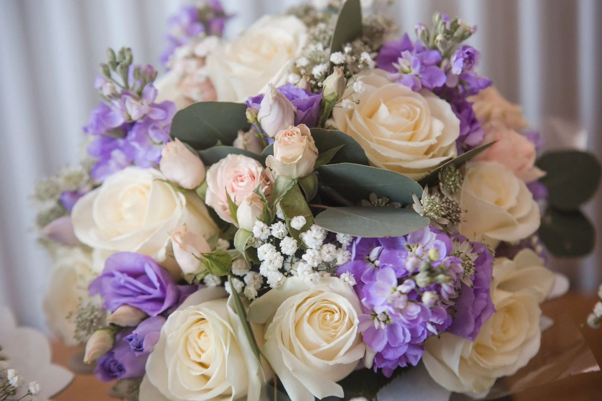
We all love those huge, crisp gallery images, but if they’re so big they make the site 'stutter' while scrolling, you’ve lost them. Most couples are browsing on their phones while grabbing a coffee, and if a site takes more than 3 seconds to load, they’re gone. Before you upload your next gallery, try running your photos through a free tool like TinyJPG or Squoosh. It shrinks the file size without losing the quality. I’m a bit of a stickler for this - I use a process called 'Smart Compression' for my clients to make sure their sites stay lightning-fast.
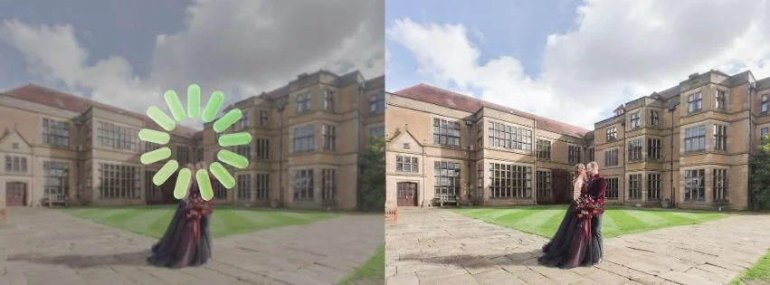
Traditional site. Slow & heavy.
Like magic. Instant & sharp.
But even just doing a quick manual resize yourself will stop you from losing leads to a spinning loading icon. Fingers crossed it helps your speed!
Biggest takeaway: If your images 'stutter' while scrolling, they’ll assume your service is just as clunky.
3. The "Frictionless" Inquiry
Simplify your contact form.
I’ve seen some contact forms that feel like a tax return. It’s the number one reason couples 'ghost' a website. My rule is to keep it to 4 or 5 essential fields - just the basics so you can get the conversation started. And here’s a tip: give them a 'Next Step' immediately after they hit send. Even a simple message saying, 'I’m probably at a wedding right now, but I’ll give you a shout within 24 hours,' goes a long way in building that initial trust.
Biggest takeaway:
A simple 'Success' page keeps the magic alive while you're busy working.
BONUS TIP: The "Living" Website (Video)
Add subtle movement with video.
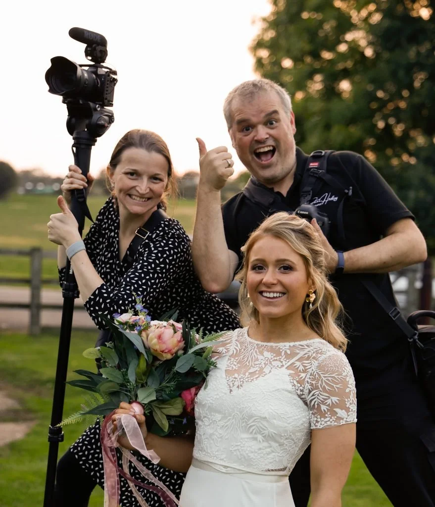
Since you’ve made it this far, here’s a little bonus I’ve been playing with for 2026. Photos are lovely, but a tiny bit of movement makes a site feel 'alive.' You don’t need a whole cinematic production - just a 5-second clip of a couple laughing or a 'behind the scenes' snippet of you working. It proves you’re real, you’re active, and you’re there. It turns a static page into a bit of a 'Magic Moment' (pardon the pun!).
Your business is built on heart. Your website should be, too.
If you’re looking at your current site and it feels a bit like a "static brochure" instead of the warm, inviting space you want it to be, I’d love to help.
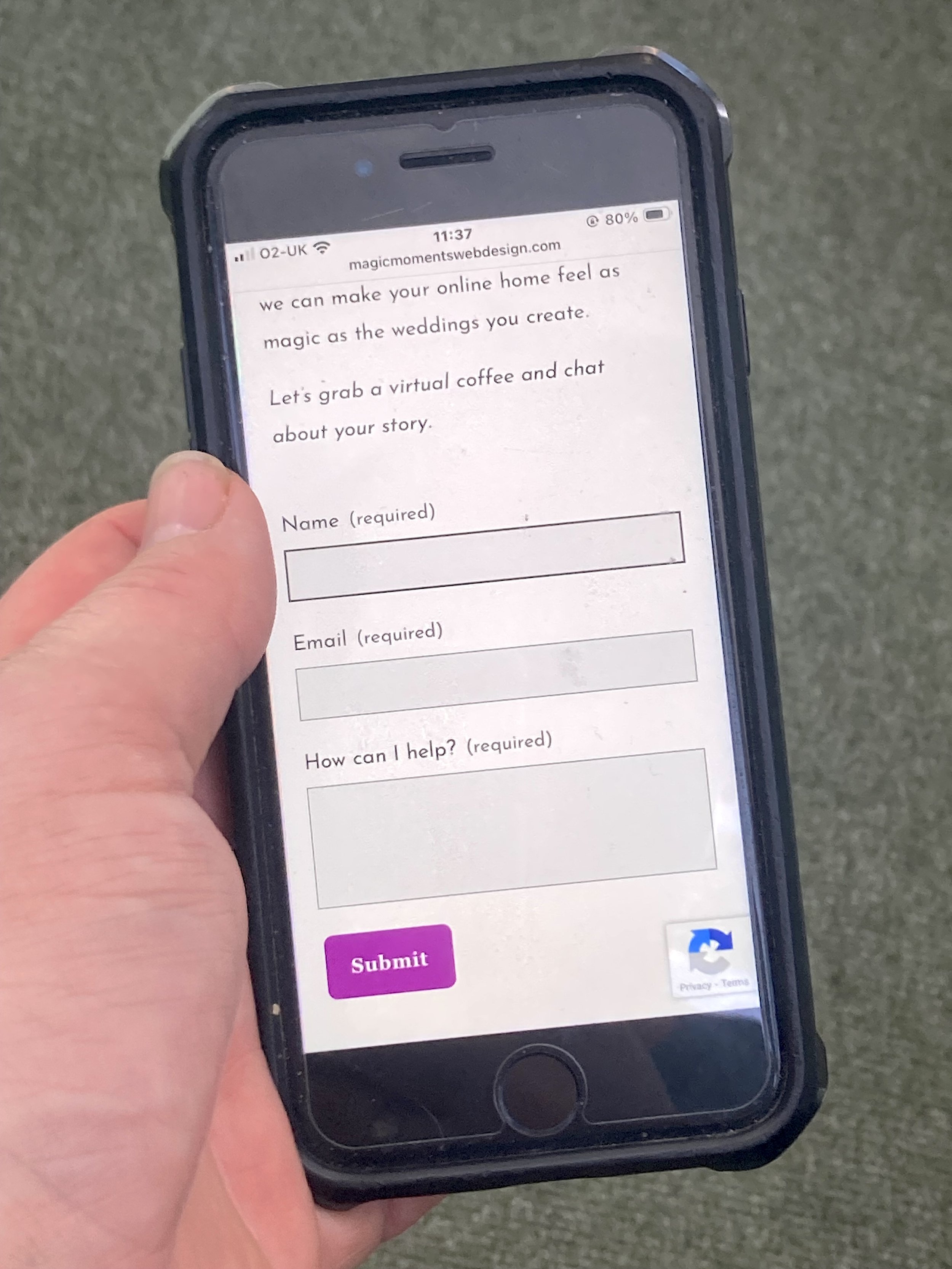
No high-pressure sales, no confusing "tech-speak". Just an honest look at how we can make your online home feel as magic as the weddings you create.
Let’s grab a virtual coffee and chat about your story.